Project

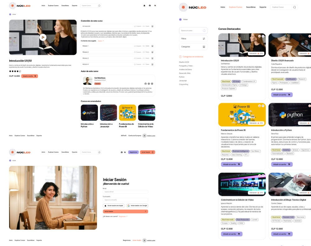
Redesign of Educational Platform (NÚCLEO)

Tools
Affinity for graphic designFigma for UI

Initial Situation

Requesting Unit: Academic Coordination of the Educational Platform

An educational institution seeks to redesign its content platform for online courses. The UX team has identified problems in the current structure: users cannot easily find courses, the search function is inefficient, and the category names are unclear. Support has been requested from the Information Architecture area to reorganize the content, improve navigation, and propose a functional prototype that enhances the user experience.

Our goal: To design a new information architecture for the educational platform, applying best practices for organization, labeling, navigation, and search.
We expect to deliver a low-fidelity prototype, validated with users, that will serve as a basis for redesigning the current system and improving the findability and usability of the content.
Phase 1: Discovery
& Empathy

What is IA?

Information Architecture is the discipline responsible for organizing, structuring, and labeling information in digital products so that it is easy for users to find and understand. It combines design principles, cognitive psychology, and information science to create intuitive digital systems.

Importance in Digital Products

Facilitates Navigation
Helps users move through the site without friction.
Reduces Information Overload
Organizes content logically to avoid overwhelming the user.
Improves User Experience (UX)
Directly impacts satisfaction and goal completion.

Business and
UX Impact

A solid Information Architecture doesn't just benefit the user; it is a business tool. By aligning user needs with business goals, we reduce bounce rates and increase conversion (enrollments and subscriptions).

Core Components

1

Organization Systems
How content, topics, tasks, and audiences are grouped.

2

Navigation Systems
Provide paths for users to move through the system.

3

Labeling Systems
Names and terms used to describe content.

4

Search Systems
Allow users to find specific information quickly.

Competitive Benchmarking

The following Benchmarking was conducted to analyze competitors and identify industry standards and market opportunities.

Structure

Labeling

Navigation

Search

Domestika

Cousera

Udemy

Hierarchical: It has categories and subcategories in its main navigation menu.
Sequential: When you purchase the course and begin studying, it is organized chronologically, with a guided path.
Matrix: The same content can be accessed from different points, for example, in tags at the bottom of the page.
Hybrid Labeling
"Plus" or "Offer" label (contextual), "Categories" menu (navigational), and software tags at the bottom of the course (metadata).
Clear and standard, Consistent vocabulary, Brand identity labels.
Multimodal Navigation
The menu always remains at the top, as well as the profile and the "Courses" button.
A sidebar appears on the course page, allowing the user to jump to the relevant section.
Allows the user to refine their search and filter without losing the context of the main category.
Hybrid Search
Text Inputs: The search engine crawls keywords in course titles, instructor names, descriptions, and even community tags.
Filters: These appear after performing a search or when entering a category.Filters can be applied by attributes.
Rigid. It is divided into Certification Specialization, Course, Module, and Lesson. It is linear because it seeks to achieve progressive objectives.
Denotative and Formal, To convey university level.
Global and local navigation. Standard navigation, top and side menus. Aims to reduce cognitive load.
Based on academic filters. Highly technical, it allows filtering by levels and suggests complete learning paths.
Predictive search: the system suggests not only keywords, but also specific categories and courses.
Global and local, multimodal navigation that adapts to the user's life cycle.
It uses industry-standard terms related to the user for categories and descriptions. It also uses status labels or "Badges".
Hierarchical structure combined with a network structure (related links).


Domestika

Structure

Hierarchical: It has categories and subcategories in its main navigation menu.
Sequential: When you purchase the course and begin studying, it is organized chronologically, with a guided path.
Matrix: The same content can be accessed from different points, for example, in tags at the bottom of the page.

Labeling

Hybrid Labeling
"Plus" or "Offer" label (contextual), "Categories" menu (navigational), and software tags at the bottom of the course (metadata).
Clear and standard, Consistent vocabulary, Brand identity labels.

Navigation

Multimodal Navigation
The menu always remains at the top, as well as the profile and the "Courses" button.
A sidebar appears on the course page, allowing the user to jump to the relevant section.
Allows the user to refine their search and filter without losing the context of the main category.

Search

Hybrid Search
Text Inputs: The search engine crawls keywords in course titles, instructor names, descriptions, and even community tags.
Filters: These appear after performing a search or when entering a category.Filters can be applied by attributes.

Cousera

Structure

Rigid. It is divided into Certification Specialization, Course, Module, and Lesson. It is linear because it seeks to achieve progressive objectives.

Labeling

Denotative and Formal, To convey university level.

Navigation

Global and local navigation. Standard navigation, top and side menus. Aims to reduce cognitive load.

Search

Based on academic filters. Highly technical, it allows filtering by levels and suggests complete learning paths.

Udemy

Structure

Hierarchical structure combined with a network structure (related links).

Labeling

It uses industry-standard terms related to the user for categories and descriptions. It also uses status labels or "Badges".

Navigation

Global and local, multimodal navigation that adapts to the user's life cycle.

Search

Predictive search: the system suggests not only keywords, but also specific categories and courses.

Guerrilla Testing

The implementation of Guerrilla Testing was critical for the project's success for the following reasons:
01.
Real-time Mental Model Validation: It allowed the team to observe how users (e.g., "Julián") process information, revealing that the core friction wasn't just button placement, but the conceptual understanding of the commercial offer.
02.
Qualitative Complementarity: While Tree Testing provided the "what" (success rates), Guerrilla Testing provided the "why," identifying that lack of transparency was the primary barrier to decision-making.
03.
Agility and Risk Mitigation: As a low-cost, high-speed technique, it validated the new hierarchy before resource-heavy UI development began, preventing the carry-over of structural errors.
Test Scenario
Imagine you were given a gift card worth $15,000 chilean pesos to spend on Domestika. You've always wanted to learn a new, randomly selected course.
Task 1:
Find a specific course
Find a beginner-level course in Spanish that costs less than $15,000 chilean pesos.
Task 2:
Review course details
Without purchasing, find out how many UNITS it has and if it includes ADDITIONAL RESOURCES (PDFs, etc.) to download.
Task 3:
Simulate purchase through payment
Add it to your shopping cart and proceed to the PAYMENT DETAILS screen. Stop just before paying.
Qualitative Interview
Ease of Search (1-5)
How easy was it to find what you were looking for?
Labeling
Did you find the "Content" and "Details" sections?
Do you know the difference between a "Unit" and a "Lesson"?
Confusing Words or Buttons
Was there any navigation confusion?
Business Navigation
Was the "Buy" button easy to recognize?
Are there any distractions with "Bundles"?
Overall Experience (1-5)
Ease of navigation and task completion.
Usability Test
Time per Task - Timers for:
Find Course
Check Quantity
Add to Cart
Clicks per Task - Clicks for:
Course
Details
Boy Button
Bounce Rate (1-5) - Perceived Ease of:
Find Course
star
star
star
star
star_border
Check Quantity
star
star
star
star_border
star_border
Add to Cart
star
star
star
star_border
star_border
Success Rate - Percentages of success in:
Find Course
Check Quantity
Add to Cart

Key Findings by User

Focus and
Distraction Issues
face
User 1
Behavior
Got lost in secondary sections such as "About Us" and "History." Saturated visual banners diverted their attention away from the actual course catalog.
Friction
It took too long to reach the actual educational offer due to an excess of corporate information.
Insight
The Home page requires a visual cleanup to prioritize access to educational content from the first click.
Business Model
Confusion
(Critical Finding)
face_2
User 2
Behavior
While attempting to purchase a course, the user could not distinguish if the displayed price was for an individual course or if it required a monthly membership.
Friction
Expressed distrust upon seeing "hidden prices" or a lack of clarity in the shopping cart.
Insight
The lack of commercial transparency is the biggest blocker to conversion. This led to the creation of the "Prices and Memberships" category in Level 1 of the final navigation.
Invisibility of
Support Materials
face_3
User 3
Behavior
Attempted to locate downloadable files within the course details but abandoned the task after 45 seconds without success.
Friction
The hierarchy of action buttons was flat; the "Download" button competed visually with other less important elements.
Insight
Support tasks must have high visual dominance. This justified relocating materials directly under the course details in the final architecture.

Julián Martínez

face
Age: 32
Pragmatic
Analytical
Direct
Impatient
Bio
Julián works under pressure and values his free time like gold. He doesn't browse for pleasure; he browses to solve. If a website asks him to "complete a form to receive a quote," he closes the tab and looks for a competitor who has the price clearly visible.
Primary Needs
- Immediacy
- Cost transparency
- 3-click booking system
Frustrations
- Intrusive pop-ups
- Lack of clear pricing
- Mandatory registration processes before checking availability

Sofía Jimenez

face_3
Age: 25
perfectionist
Analytical
Extroverted
Explorer
Bio
Sofía is a curious professional who uses her free time to explore new creative skills. She has purchased several course bundles on Domestika during sales, but her dashboard feels like a "to-do list" that never ends.
Primary Needs
- Needs someone (or something) to tell her exactly which course fits her current level.
- Seeks a structure that connects several courses into a "learning path" or a larger goal.
- Small, achievable objectives to feel progress despite her busy schedule.
Frustrations
- Overwhelming amount of information
- Not enough clarity on course's difficulty
Phase 2: Definition & Information Architecture (IA)

Preliminary Taxonomy

The Preliminary Taxonomy is presented as the structure of the 'initial assumption' designed to organize the content in a logical and hierarchical manner. Its importance lies in establishing a navigation base (Levels 0, 1, and 2) that aims to solve the friction points identified in the guerrilla test, serving as the original mental model that will later be validated and adjusted through Card Sorting with real users.
Level 0
- Header (Logo, Search Bar, Log In, Register)
- Footer with contact information
Level 1
- Explore Courses
- Prices and Memberships
- My Account and Progress
Level 2
- Learning content
- Additional resources
- Teaching staff and training experience

Card Sorting

The Preliminary Taxonomy is presented as the structure of the 'initial assumption' designed to organize the content in a logical and hierarchical manner. Its importance lies in establishing a navigation base (Levels 0, 1, and 2) that aims to solve the friction points identified in the guerrilla test, serving as the original mental model that will later be validated and adjusted through Card Sorting with real users.

Key Findings

apps
The results of the Similarity Matrix confirmed that users group the courses by software (Figma and Photoashop) with a 100% match
label
It was detected that the initial label 'Additional Resources' was ambiguous. Users tended to prefer the category 'Support Material' to group files and downloadable content.
view_column
The Dendrogram showed a strong connection between the lessons and the support material, suggesting that they should live in the same navigation section.

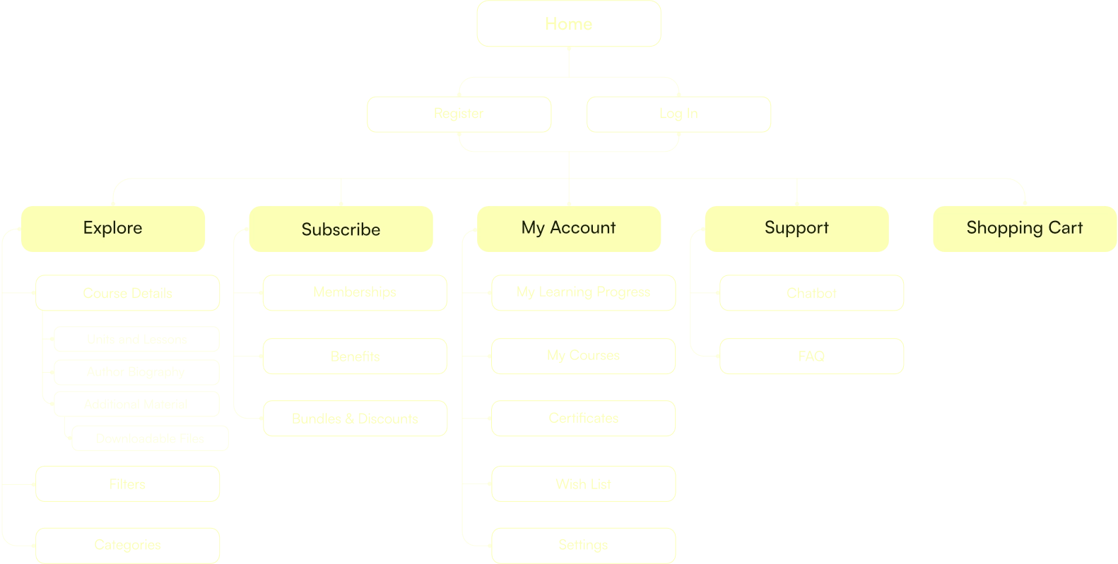
Sitemap

Comprehensive Sitemap diagram for the NÚCLEO platform, illustrating the hierarchical structure and navigation paths for an optimized educational user experience.

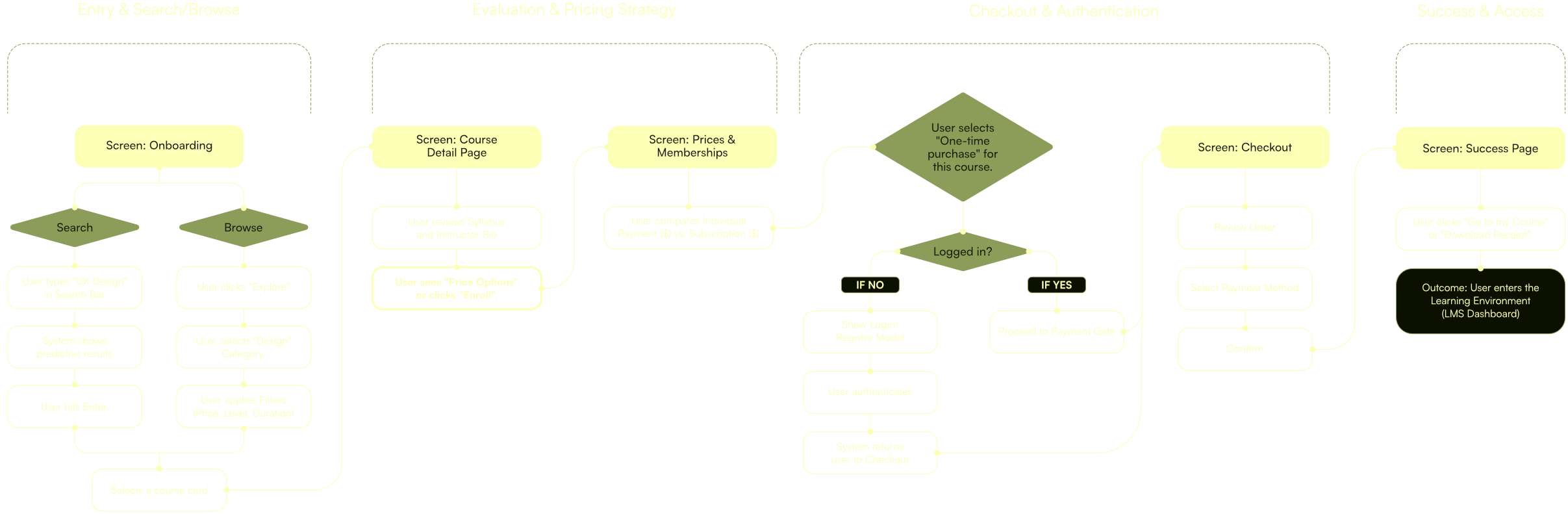
User Flows

NÚCLEO platform User Flow chart, detailing the step-by-step digital journey and logic sequences to reduce cognitive overload during the learning process.

Tree Testing

The Tree Testing aims to evaluate the ability to search for elements within the Domestika hierarchy. We want to verify whether the content organization defined in the inventory matches the user's mental model, eliminating distractions to measure only the effectiveness of the labels and the depth of the branches.

Findings The results confirmed that 55.6% of users achieved the correct answer. For this, we used the Tree Testing tool on the UXTweak platform. We consulted with a group of 9 people, evaluating our navigation map and generating a node path. We asked the following questions regarding the paths we wanted to evaluate:

01. Search for a Marketing course
02. Download a file from a course

Key Findings

fact_check
The results confirmed that 55.6% of the users achieved the correct answer.
keyboard_return
This same percentage completed it without doing any backtracking.
access_time
The approximate time to complete the tasks was a total of 56 seconds.
error_outline
Between the two questions, the one with the most errors was the second (2) Download a file from a course.
route
Therefore, the idea of generating a download path to some file must have greater clarity when being integrated into the platform, since this is a critical point.
Phase 3: Ideation & Conceptual Design
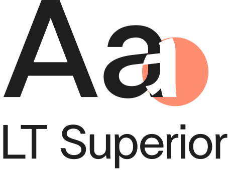
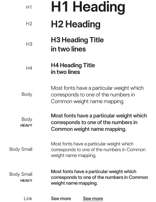
The LT Superior font is a geometric sans-serif typeface that stands out for its clean lines, modernity, and well-balanced structure. Due to its high legibility and contemporary aesthetic, it is an excellent choice for projects that aim to convey:

Efficiency, clarity and
technical professionalism.
Primary
#FF8E70
#F4A994
Base
#FFFFFF
Secondary
#FF8E70
#FF8E70
#FF8E70
Terciary
#FF8E70
#FAF9BC
Terciary
#FF8E70

Mid-Fidelity Wireframing

Design System

Professional laptop mockup displaying the NÚCLEO educational platform user interface and information architecture design.
Researchers and Designers: Deb Larenas, Paola Riveras, Joaquín Pérez, Tabata González, Daphne Gorigoitia
Methodology: User-Centered Design (UCD) & Iterative Prototyping.
Timeline: 2 weeks.
Tools:
Blender for 3DAffinity for graphic designFigma for UI
next case study:

AKORA – A Vision of
Feminine Techwear.

Go to next projectarrow_outward

Ready to build your visual ecosystem? Let’s talk.

Thank you!
Your submission has
been received!
Oops! Something went wrong while submitting the form.